
Forecast Update - June 2025
Update of Brent and WTI forecasts.
Dear subscribers,
At the beginning of each month, we will be sending you an email like this with an updated forecast of energy prices. Commodia brings together top academic economists who specialize in the analysis of global energy markets. The team has more than 20 years of experience from leading universities across the United States, Canada, Europe, and the Asia Pacific. Our forecasts are based on state-of-the-art forecasting techniques to predict energy commodity prices.
Learn more about the Commodia team:👤 About us
And about our econometric model: 📑 Econometric model
You can also always check our latest forecast on the website: 📊 Forecast Chart
🛢️Oil Market - May 2025 Summary
In May 2025, global oil prices continued their downward trend, with Brent crude averaging approximately $64.45 per barrel and WTI around $61.03 per barrel. This decline was primarily driven by OPEC+'s decision to accelerate production increases, adding 411,000 barrels per day for June, effectively advancing supply levels previously scheduled for later in the year. The surge in supply, coupled with economic uncertainties and the global transition to greener fuels, exerted downward pressure on U.S. crude exports and prices.
🟧 Commodia - Forecast Update of Brent
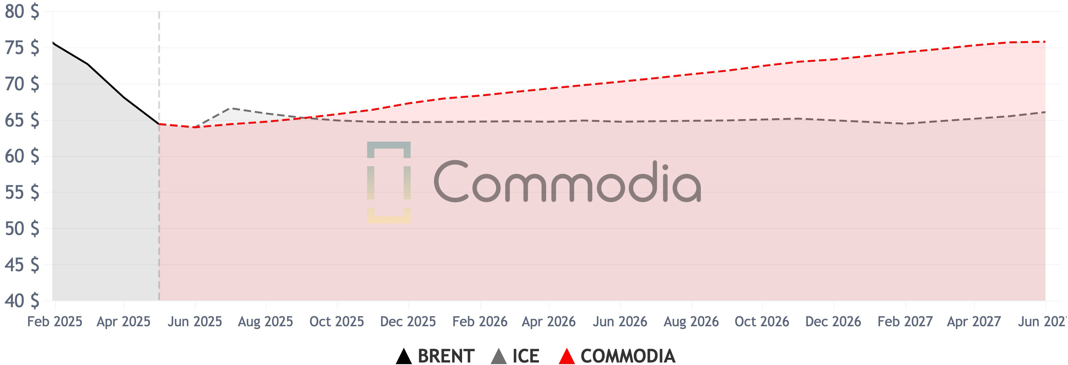
📈 Comparison of Commodia Forecast vs. ICE Future Price
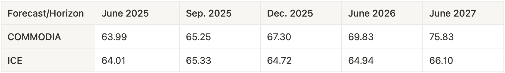
In June 2025, Commodia forecasts Brent crude oil at $63.99 per barrel, virtually equal to ICE’s forward price of $64.01. By September 2025, Commodia projects $65.25, just 0.1% lower than ICE’s $65.33.
By December 2025, Commodia's forecast rises to $67.30, which is 4.0% higher than ICE’s $64.72. In June 2026, the gap widens as Commodia anticipates $69.83 per barrel, 7.5% higher than ICE’s $64.94. Looking further ahead to June 2027, Commodia projects $75.83, which is 14.7% higher than ICE’s forward price of $66.10.
🟥 Commodia - Forecast Update of WTI
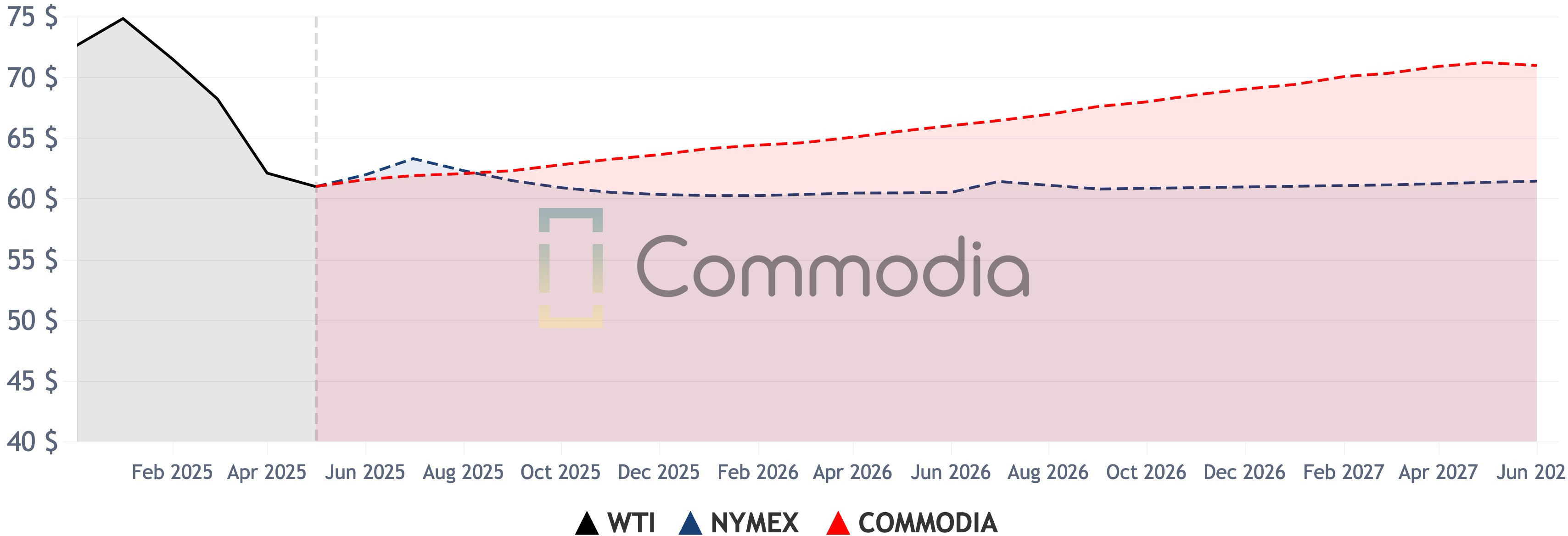
📈 Comparison of Commodia Forecast vs. NYMEX Future Price
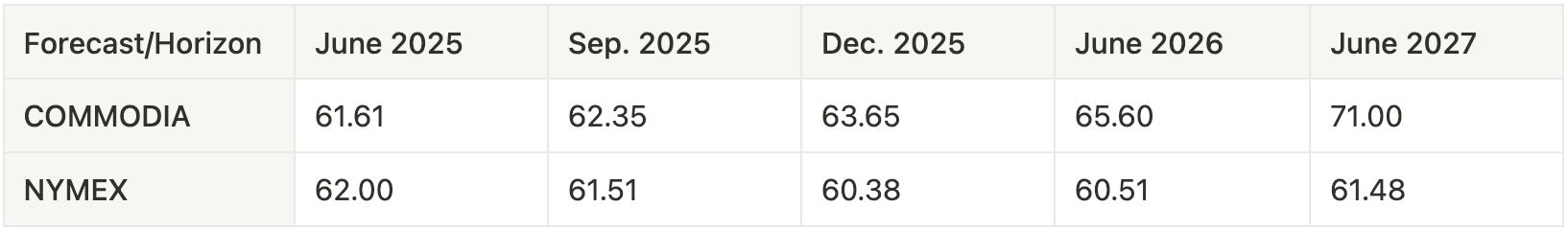
In June 2025, Commodia forecasts WTI crude oil at $61.61 per barrel, which is 0.6% lower than NYMEX's forward price of $62.00. By September 2025, Commodia projects $62.35, 1.4% higher than NYMEX’s $61.51.
By December 2025, the gap widens, with Commodia forecasting $63.65, which is 5.4% higher than NYMEX’s $60.38. In June 2026, Commodia expects $65.60, which is 8.4% higher than NYMEX’s $60.51. Looking ahead to June 2027, Commodia projects a sharp increase to $71.00, which is 15.5% higher than NYMEX's forward price of $61.48.
🗝 Key drivers of Commodia’s crude oil forecast from the previous month
The main variables influencing Commodia's crude oil forecast (Brent and WTI) are global fuel consumption, global economic conditions, and OECD petroleum inventories. The main change in our forecast from May is a small increase in OECD petroleum inventories, which has put downward pressure on our oil price forecasts (1.35% decline in WTI and 5.12% in Brent).
The main determinants of Global Economic Conditions are shown in the figure below:
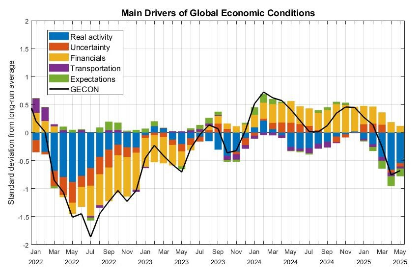
Chart of Main Drivers of Global Economic Conditions from Christiane Baumeister & Dimitris Korobilis & Thomas K. Lee, 2022. "Energy Markets and Global Economic Conditions" The Review of Economics and Statistics, 104(4), 828-844.
The main determinants of Global Economic Conditions are shown in the figure above for the period January 2022 to May 2025.
For more details about the Global Economic Conditions index visit: https://sites.google.com/site/cjsbaumeister/research
References
International Energy Agency (IEA). (2024). Oil Market Report - May 2024.
U.S. Energy Information Administration (EIA). (2024). Short-Term Energy Outlook - May 2024.
BNN Bloomberg. (2024). Oil Markets Look ‘Reasonably Well Supplied’ in 2024.
Tell us what you think — Leave your comments and thoughts on our analysis and tell us what you think will happen in the market in the coming months.
⬇️ Download it — Download the forecast you saw in this report!
📊 Use it — See our forecasts and compare it with most popular market index.
🌐 Share it — Share this newsletter with your team or with someone to whom it might be useful!
All opinions and estimates in Commodia Website and Newsletters are given in good faith regardless of source, and the user assumes the entire risk related to using this information. Commodia and the authors are providing this information” as is,” and the authors and Commodia disclaim all warranties, whether expressed or implied, including (without limitation) any implied warranties of merchantability or fitness for a particular purpose. The authors and Commodia will not be liable for any damages or lost profit resulting from any use or misuse of this information.
Commodia Team
Hello - thanks for providing this forecast, it is very helpful. For the GECON graph, it looks like the graph shown here is different than the Excel file found on Christiane’s website: https://sites.google.com/site/cjsbaumeister/datasets
The graph in Commodia has gone down the past few months, while the Excel file shows it increasing and decreasing. Can you advise on this? Thanks!